

When Jon and I moved back to the Pacific Northwest, we had no idea it would take so long to sell our previous home. As we waited to get our equity out of a relatively slow housing market, the market in Seattle skyrocketed and the competition got stiff.
Not only is the competition with homes for sale stiff, so is the competition for rentals. We did finally sell our previous home, but the timing was not well aligned for us with what’s happening in Seattle’s real estate market.
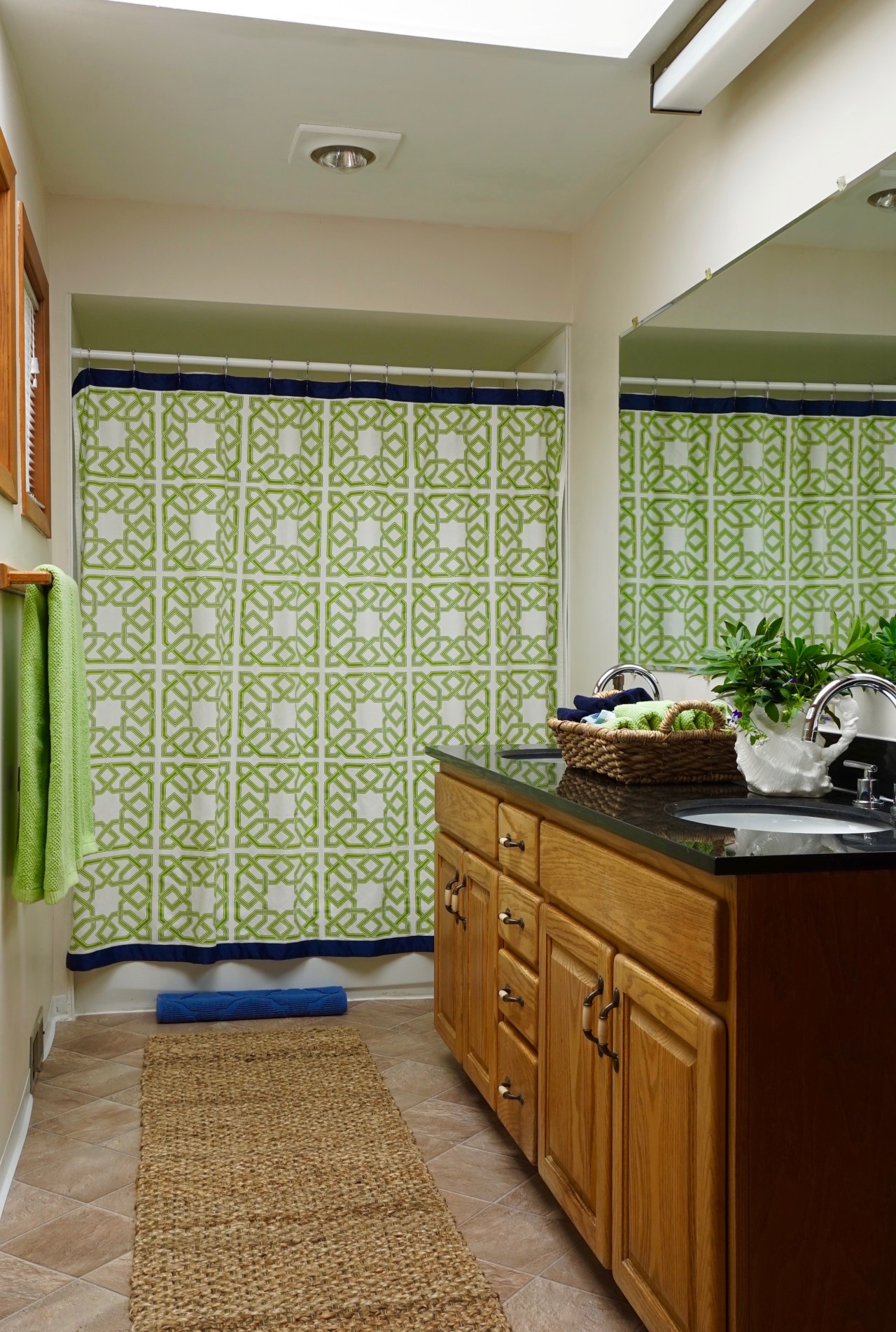
Accessories: My attempt at distracting the eye from a multitude of decor issues.
We have found ourselves living in the least loved and cared for home that I think I have ever been in. It’s a disappointment because it has so much potential.
The clashing undertones and terrible finishes in this home were more than enough to scare many potential renters away, but I am a glutton for punishment. The rental ad actually described the house as “Completely Remodeled”. I didn’t want to hurt the owner’s feelings by challenging that claim, but I did tell her “some of the finishes are kind of rough”, to which she looked puzzled.

BEFORE, But After it Was Sanitized
For the first 2-1/2 months we lived here, I didn’t go into this bathroom to wash my hands. It was so filthy (but not nearly as filthy as the two downstairs) and I didn’t have it in me to face what felt like another assault by going in there to clean.

An Example of a Rough Finish – This is Behind the Toilet, imagine if the toilet floods! Aggh!
I didn’t notice many of the shoddy details until after we moved in because there were numerous others that were louder.
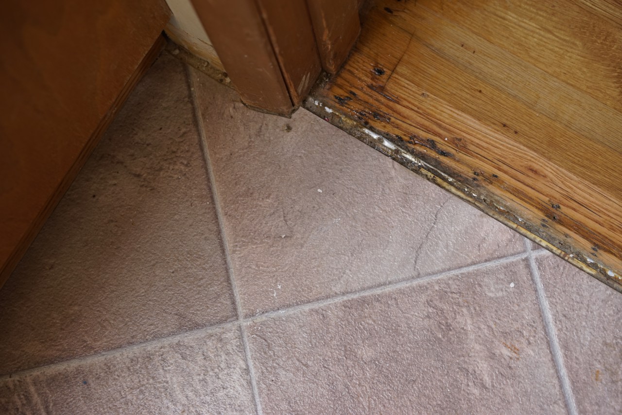
More Staples Next to the Tub
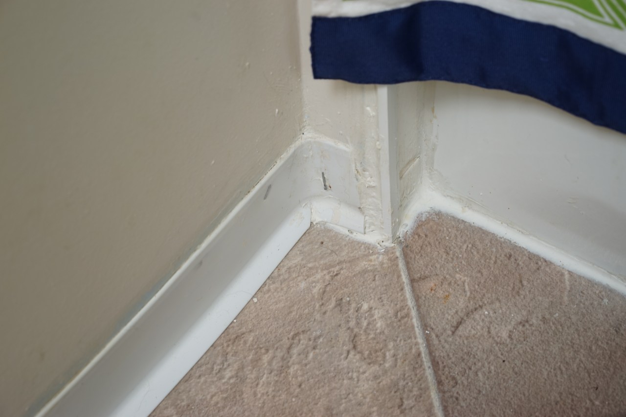
Besides clashing floors, there is no threshold or baseboard, the paint drips and stain on the vinyl add to the barrage.
Missing Strike Plate and White Caulking With Black Granite – Never Mind the Condition of the Walls!
My initial plan was to paint the room and re-caulk the joint between the counter and backsplash or paint over the white caulking with black. I talked to our landlord about painting the cabinet and window casings and I was going to install new baseboards, but our rental contract (which is something like 17 pages long) forbids any improvements without the landlord’s written consent. I never got the consent.
I’m a decorator and my passion is in architecture and renovation. When I am faced with quandaries like the one here, I first identify the problem(s) and then specify what needs to go away and what it will be replaced with. This is the first time I have ever had to keep everything in place and work around it. I am looking at this as a challenge that will round me out and make me a better person down the road!
Since I had to work with clashing undertones and unpleasing elements, my plan of attack was to distract the eye from as many offending aspects as possible.
My True Colour Expert™️ training was fun to use here! I was easily able to discern the odd man out – the green beige shower curtain, so I removed it. The orange beige woodwork had to stay and so did the horribly clashing violet grey flooring. I counted a total of 5 or 6 undertones in the room. In case you are unaware, that’s about 3 or 4 undertones too many!
There are a few tricks of the trade that come in handy in a situation like this: REPETITION makes a space feel cohesive. TEXTURE adds interest; a REDUCTION OF CLASHING UNDERTONES decreases the resulting visual assault; tasteful DECORATIVE DISTRACTIONS give the eye something good to focus on; and CLEANLINESS is peace giving.
DECORATIVE DISTRACTIONS – I pulled the Jonathan Adler shower curtain out of storage. It became my decorative distraction and focal point. It also added freshness to the room.
TEXTURE – I needed something interesting that would partially hide and minimize the odd and unrelated black granite countertop, so I chose the gold beige (with bits of orange beige) basket, which looks nice with the woodwork. I filled the basket with washcloths and hand towels.
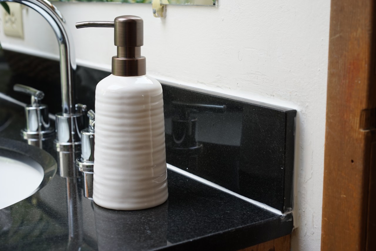
REPETITION – I repeated the woven texture and color of the basket in the floor runner and garbage can next to the toilet. The washcloths and towels in the basket repeat the colors in the shower curtain, as do the towels hanging on the bars. The soap dispensers repeat the wall color and their pumps mimic the dark bronze metal on the cabinet handles.
REDUCTION OF CLASHING UNDERTONES – I removed the clashing shower curtain and replaced it with something less offensive.
CLEANLINESS – Everything feels better when it’s clean.

A clock and little sign sit in the windowsill.
Normally, items sitting on a windowsill are clutter, but I see this as a distraction from all of the chaos in the room. I don’t usually like clocks like this for decoration. I think it is unrestful to constantly be reminded of the time in areas like living rooms and family rooms. But it makes sense in a bathroom.
This clock serves a few good purposes. I usually bring my phone into the bathroom, so I can keep track of time, but a clock like this can be seen from all angles. It also serves as artwork and because it repeats the orange beige of the woodwork, it makes the windowsill look less like a sore thumb.
I am not a fan of towel bars, hooks are much more interesting to me and they don’t monopolize long stretches of walls. In this case, though, I had to work with what was there and they at least gave me the opportunity to spread more happy apple-green around the room in the form of bath towels.
People tend to do one of two things with towel bars. They either use them to hang wet towels to dry, which usually doesn’t look decorative or charming or they hang their fanciest towels in unused layers, which then become dust collectors! And how many times have you seen someone’s towel bar displaying towels that went out of style decades ago?

BEFORE: Boring and clashing undertones

AFTER: A few decorating tricks to improve this unattractive room. The battery operated star marquee above the toilet is from Target.
The star marquee from Target is made of lightweight wood. Orange beige undertones pop through some of the wood grains, which repeat the undertones in the existing woodwork. This marquee has an on and off switch with the option to automatically turn off after 4 hours, which makes it a great night light. Also, because it is battery operated, it doesn’t need to be hung near an electrical outlet.

Another view of my effort to distract the eye from clashing undertones and offensive finishes.
If you are struggling where you are, be of good cheer! This too shall pass!


What an amazing transformation. You are a magician, Melissa!
LikeLiked by 1 person
Thank you Janea!
LikeLike
FRESH, FRESH, FRESH.!!!! Your redecoration is warm, inviting and definitely “makes the heart happy” Girlfriend! It makes me see all the updates I could benefit from in my bathroom. That’s what a great decorator does. 💕
LikeLiked by 1 person
The dirty and clean colors in the fixed elements fight, happy yellow-green was a good way to bring some balance and freshness into this room.
LikeLike
Love it Melissa! Thanks for sharing!
LikeLiked by 1 person
Thank you Jan for viewing! This room is worthy of being in Maria Killam’s color training for clashing undertones. It breaks every rule!
LikeLike
You never cease to amaze me. Love how you made it a happy room. Also love your photography…you capture the angst of the slipshod construction so well. Staples for vinyl baseboards. Who knew?
LikeLiked by 1 person
Yes! You so aptly called it what it is: the angst of slipshod construction! Don’t you wish you had known this use for staple guns previously? It’s like upholstering trim work to the wall!😉
LikeLike
You did it! So fresh! So clean! So appealing! Way to be awesome!
LikeLiked by 1 person